Have you ever wanted to design a simple Facebook Reaction using HTML, CSS and most of all Javascript to alerts something to the user? In this tutorial I’ll guide you through designing yours with the best design you might have imagined.
Before we continue with this tutorial, I’d assume you have a basic knowledge of HTML, CSS and Javascript. Anyways, if you are new to any of these, you can as well download the full script at the end of this post and simply upload to your server to have a working and stunning looking calculator webpage.
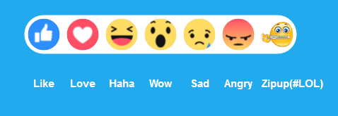
Here’s what we’d be having at the end of this tutorial.
You can also check out the live demo by following the link below.
Let’s start with the HTML code. You can create a file in your favorite text editor (Notepad, Notepad++, Sublime Text, Visual Studio code etc.). Then copy the below HTML code and save as “index.html”. The below code contains the buttons and circles that houses the structure of the Reaction.
<!-- Created By https://www.sololearn.com/Profile/3182347(Kartikey Sahu)
Edited and Modified By https://www.sololearn.com/Profile/4479976 (Isaac Frank)-->
<!- I added another reaction and wrote the names under-->
<!DOCTYPE html>
<html>
 <head>
  <title>Isaac Frank Reaction</title>
 </head>
 <body>
  <p class="f">f</p>
        <span>Facebook Reaction By Isaac</span>
        <a href="https://www.sololearn.com/Profile/4479976">Follow me on Sololearn</a>
        <div class="bar">
            <div class="circle">
   <br/>
   <p class="w">Like</p>
            </div>
            <div class="circle">
   <br/>
   <p class="w">Love</p>
            </div>
            <div class="circle">
   <br/>
   <p class="w">Haha</p>
            </div>
            <div class="circle">
   <br/>
   <p class="w">Wow</p>
            </div>
            <div class="circle">
   <br/>
   <p class="w">Sad</p>
            </div>
            <div class="circle">
   <br/>
   <p class="w">Angry</p>
   </div>
   <div class="circle">
   <br/>
   <p class="w">Zipup(#LOL)</p>
            </div>
        </div>
        <footer>
    <a href="https://www.facebook.com/isaac.frank.3990">Follow me on Facebook</a><br>
    <a href="https://www.twitter.com/zikyfranky">Follow me on Twitter</a><br>
    <a href="https://www.instagram.com/zikyfranky1">Follow me on Instagram</a>
    </footer>
 </body>

</html>
HTML for Simple JS Calc
After you must have saved the above code in your choice directory or folder, it’s time to write the CSS to style our calculator into a beauty. This css file as you can see from the above code is already linked.
body {
    background: #2ae;
    color: #333;
    text-align: center;
    font-family: 'Open Sans', sans-serif;
}

p.w {
    color: #fff;
    font-size: 15px;
    border-radius: 2px;
    margin: 25px 0 0;
    font-weight: 600;
}
p.f {
    color: #fff;
    font-size: 32px;
    width: 42px;
    height: 42px;
    display: inline-block;
    line-height: 62px;
    background: #3b5998;
    border-radius: 2px;
    margin: 25px 0 0;
    font-weight: 600;
}

span {
    display: block;
    color: #fff;
    font-size: 14px;
    text-transform: uppercase;
}

.bar {
    background: #fff;
    border-radius: 45px;
    display: table;
    height: 55px;
    position: absolute;
    top: 50%;
    left: 50%;
    -webkit-transform: translate(-50%, -50%);
    -moz-transform: translate(-50%, -50%);
    -ms-transform: translate(-50%, -50%);
    -o-transform: translate(-50%, -50%);
    transform: translate(-50%, -50%);
}
.circle {
    width: 45px;
    height: 45px;
    border-radius: 50%;
    background: #ff9;
    float: left;
    margin: 5px;
    display: block;
    text-align: center;
    line-height: 45px;
    transition: 0.5s;
}

.circle:hover{

    -webkit-transform: scale(1.2);
    -moz-transform: scale(1.2);
    -ms-transform: scale(1.2);
    -o-transform: scale(1.2);
    transform: scale(1.2);
    transition: 0.5s;
}
.circle:nth-child(1){
    background: url("https://i.imgur.com/wVAJS8T_d.jpg?maxwidth=640&shape=thumb&fidelity=medium") no-repeat center;
    background-size: 3.2pc;
}

.circle:nth-child(2){
    background: url("https://i.imgur.com/y7qZQS3_d.jpg?maxwidth=640&shape=thumb&fidelity=medium")  no-repeat center;
    background-size: 3.2pc;

}
.circle:nth-child(3){
    background: url("https://i.imgur.com/eq69HEz_d.jpg?maxwidth=640&shape=thumb&fidelity=medium") no-repeat center;
    background-size: 3.2pc;
}

.circle:nth-child(4){
    background: url("https://i.imgur.com/XQSbgpw_d.jpg?maxwidth=640&shape=thumb&fidelity=medium")  no-repeat center;
    background-size: 3.2pc;
}
.circle:nth-child(5){
    background: url("https://i.imgur.com/JlQiyAu_d.jpg?maxwidth=640&shape=thumb&fidelity=medium") no-repeat center;
    background-size: 3.2pc;
}

.circle:nth-child(6){
    background: url("https://i.imgur.com/P4Xm6Ds_d.jpg?maxwidth=640&shape=thumb&fidelity=medium")  no-repeat center;
    background-size: 3.2pc;
}
.circle:nth-child(7){
    background: url("http://femoticons.net/images/stickers/smileys/shutting_up.png")  no-repeat center;
    background-size: 3.2pc;
}

p {
    margin-top: 15px;
}
You have to save this codes as “style.css” and in the same directory as the “index.html” you saved earlier.
Now this is where the magic happens. We are going to use javascript to handle all the calculations. Below is the javascript code you need. Make sure it is saved as “script.js” in the exact same folder as the files above.
alert("What reaction do you think this code deserves? Tell me in the comment ðŸ¤\n Note I included ZipUp Smiley lol");
alert("Please Your Comments and Upvote is really Apreciated");
0 comments:
Post a Comment